Thursday, 23 April 2015

OUGD502: PPP- Presentation

The presentations were really interesting to sit and watch because I found that I learnt an awful lot about other students on the course- what stood out to me most is that now in second year people's outlooks seem to have changed on what they view as graphic design. It's really interesting to see that everyones prospective future ideas of their chosen careers are completely different and for instance my interests were different to some of the others who presented at the same time. 

Unlike some of the others I didn't take about having a 1/2/5 year plan because I'm not 100% sure at the moment, Id like to think I will gain some work experience and this will help form my future decisions but for the moment I am enjoying creating a broad range of work. In terms of future plans which is something I have always thought about I would love to own a small company of my own or perhaps work in a small studio- I don't feel comfortable to be creative in large studios or with large amounts of people as I already feel more confident working on my own or in a small group rather than a large number of people as I feel as though I am too quiet/shy to voice my own opinion sometimes. 

I felt like my presentation went quite well even though I was incredibly nervous beforehand and could definitely feel myself shaking- this seems to be a reaction I have no matter what size the group is, however I feel as though I have improved and with advice of practising and rehearsing what I'm going to say it definitely made me feel more confident and prepared. 

Monday, 20 April 2015

OUGD502: Module Evaluation

I have enjoyed creating work for this module as I can now see its usage in the world outside of the university degree programme. Within second year this module definitely becomes more important and I have certainly found that each of the modules have somewhat fed into each other as I have been able to gain more knowledge in skills and also access a broader range of inspiration on websites and books that I have been introduced to. 

I now see why networking is incredibly important and it has definitely helped especially in the current project for design practise 2 I used emails and blogs to be able to talk to people about Autism which isn't necessarily something design related but has been helpful non the less. I have also found networking useful by using Linkedin for context of practice as by being able to access a wider audience this has meant ive been able to gain many responses about printmaking in current graphic design. I thoroughly enjoyed gaining and insight into setting up a business when I worked with Rebecca and this is something that will definitely be useful in the future as I think eventually I would love to work for a small studio or perhaps even have my own business. I'm still unsure about contacting studios as I am quite shy but I recently asked a letterpress studio in Blackburn about taking part in a workshop, perhaps if I am able to do this I will feel more confident to ask about work experience but this may also lift my confidence to ask studios in Leeds too. 

If I could change anything about the experience of this module it would be to push myself to visit more exhibitions and make time to do so. As I find myself quite busy with university work especially when I was completing for the deadline for responsive I found that many exhibitions I wanted to visit I couldn't make time for so therefore I have learnt that I perhaps need to manage my time more efficiently. But PPP has also had a positive impact on my sourcing of research too as I have now been able to access both Behance and Cargo Collective this has enabled me to view work from many different sources and countries from not only studios but individuals too. Over the summer and in level 6 I want to try and contact designers and studios to gain more confidence in knowing what to say even if they don't reply, this is something I have struggled with bringing myself to do in level 5 but I have tried. I have thoroughly enjoyed PPP this year especially being able to present my work in a more professional manner makes me feel more confident about my own abilities. 

OUGD502: PPP Presentation

http://www.slideshare.net/melissamorris37625/ppp-secondyearpresentation-47211635


OUGD502: PPP- Studio research (Leeds)

These two studios are larger and I have enjoyed viewing their work, however for the time being I'm unsure on how to approach them. I also plan on trying communicate with studios locally to try and gain some relevant work experience. 


GOLDEN


https://www.behance.net/wearegolden

When I started to look at studios in Leeds I found GOLDEN and thoroughly enjoyed looking through some of the briefs. In the responsive module I completed work for record sleeves and a penguin book cover so therefore this type of work appeals to me because it is something I would enjoy creating myself. 


Robot Food (Leeds)

This studio is one I have looked at previously and I love some of the packaging work they complete as they are quite quirky. They also have some elements of hand rendered illustrations and this is somewhat similar to my own style. 


The image is also another sample of work which is something I aspire too. I enjoy creating work with a hand rendered element so therefore If i were to work somewhere like this in the future I would thoroughly enjoy creating work similar. 

When looking at a few studios in Leeds I wanted to briefly mention that I am inspired by people who have their own businesses and when looking at studios I'm not in fact 100% what kind of studio I would fit into. I guess with more research in level 6 this is something I will discover myself but for the meantime I've been looking at studios such as Emily McDowells:


http://emilymcdowell.com

Her business flourished because of the success of one card. Much like the letterpress studio in Blackburn I seem to enjoy looking at work which has some form of character and a personal touch to it. The illustration and hand rendered type is beautiful in its form and what the type says is also vitally important too as the cards and other items are witty and humorous which is also put across in her branding too. I find self made stores quite inspirational and in the future when I graduate I think this is something I would consider doing myself as I quite enjoy making products as well as working on briefs. 

Sunday, 19 April 2015

OUGD502: Cargo Collective


Cargo Collective is a website format I have always known about but of course you can only access it through invite only- this was when I created a behance account instead. However  a few years ago I came into contact with a product design student from London called Fran who quite liked the work I was producing, from that point on we have been in constant contact with each other sending each other work which is patricianly developed to gain feedback from other sources out of our university surroundings. After completing my online  portfolio and business cards I sent her the link to the work. From this contact she gave me an invitation to cargo which has allowed me to create a profile, hopefully this will allow me to have a slightly more professional online presence as this is for designers only through invitation. 

https://www.behance.net/Fran_Bonner


My cargo profile:

http://cargocollective.com/MelissaMorrisDesign


OUGD502: PPP visit to Poole/ Dorset

Over the easter holidays I visited rural locations within Poole and Dorset. It was a great opportunity to view some of the locations graphic design and signage. 


I found lots of hand painted shop signs and also typography painted onto pubs at the quay too. Some of the older boats were also being painted whilst I was there and it was incredibly interesting to see some of the artwork created by traditional sign painters. When creating my own artwork I have enjoyed hand rendered elements so this experience has only broadened my mind to other forms of printmaking and type. 

OUGD502: PPP- Studios

 In terms of PPP and studios I have only recently started looking at potential local places which I could approach possibly for work experience or just to have contact with. Up till this point I have felt quite shy and unsure about what sorts of studios I want to experience. 

http://www.printforloveofwood.com/gallery/
http://www.printforlove.co.uk

I recently came across this small letterpress stationary business which is located near my hometown. I looked through the work when researching for context of practise and it is similar to some of the work I am doing for printmaking. I liked the consideration in the presentation of her work through the product photography but also the range in which she produces, it isn't just letter-pressed posters she produces all kinds of different work. 


It was also intriguing to see the blog she has too which shows inspiration for the different pieces of artwork and development. This gives a further insight into her personality as a brand and the kinds of work she produces. 


The inspiration and her work is closely linked to some of my own interests in history and literature so therefore to begin contact I tweeted her to ask about workshops. If I were able to take part in one of these workshops it would allow me to see her studio and the work she does more closely and perhaps the opportunity may arise to ask about work experience. 


I have also sent an email to a previous student/grad of Leeds college of art who did work experience there too:


OUGD502: Self Branding- Prints

Because I had limited amounts of time and couldn't access facilities during the easter break I took this opportunity to use online printers such as MOO who were incredibly helpful. I also sent my designs off to be printed for my book too however if I had more time I would of printed and bound this myself. 

Printed book pages with a spiral bound to allow for the pages to lay flat and therefore the work samples be viewed with ease. 


Business cards printed at MOO in a square format to suit the logo's size


I am happy with my final design because it is something which is practical and usable. If I had created something which had an quirky or sketchy style this perhaps may of not worked across a range of different media but also sit well when places with my work samples. Through creating a logo which has a certain style I feel as though they would of also put me in a position where I possibly would be stereotyped for creating one type of work when in fact I love working on a large variation of work. To ensure this would be possible I kept my logo as clean as I possibly could with a hint of femininity in the curves of the custom M. 

 So therefore as a piece of branding it isn't necessarily to portray my personality but in fact be clean enough to allow the work to speak for itself and be non invasive. If I had more time I would like to have created some other business stationary but for the time being as a second year student I don't feel as though I necessarily need these but perhaps when contacting studios I could create myself some custom envelopes for the post for example. However on the whole I'm happy ive been able to produce my branding across a range of both online media which I can update regularly and also through a printed format. 

Saturday, 4 April 2015

OUGD502: PPP- Self branding: Website, behance & creative cv

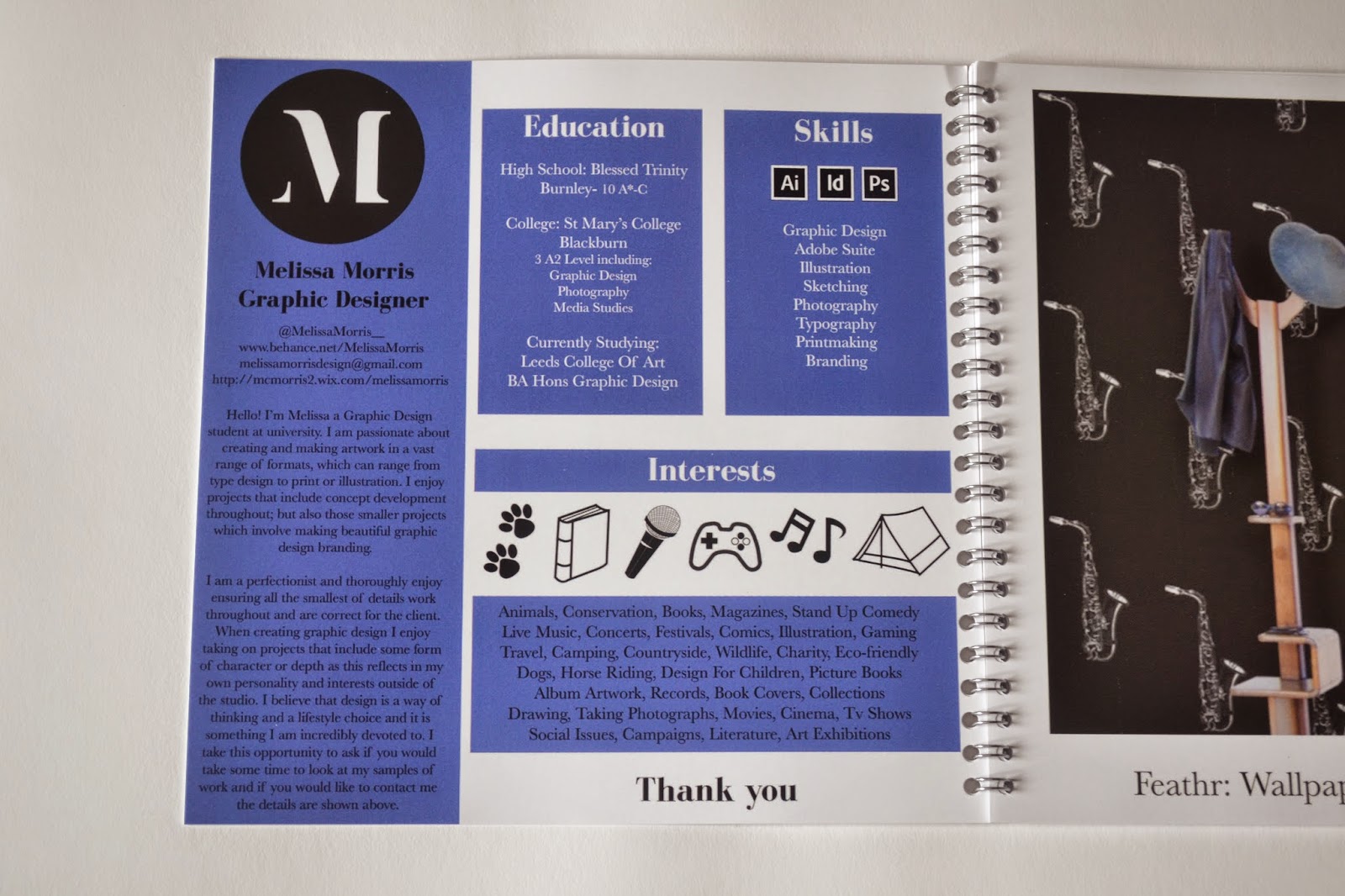
Through making my logo and thinking about creating a pack I realised that normally they would include stationery but for the purpose of now this wouldn't be suitable or useful. So instead with a limited budget I decided to make a printed book but also a pdf version of a creative cv which would hold information and photographs of my work together. 

Here is a link to the final booklet I created for online purposes which could be used to send to studios in relation to work experience for example. 


http://issuu.com/mm250174/docs/melissa_morris_design


See pages below also:


In total there are 30 pages including different samples of work from first and second year of this course. I also made a page which works as a cv with a small description about myself as well as skills, interests and software which gives a small insight to me without too much reading. I used purple on the CV page and within the book because this is a colour which people suggested that I used. It also works quite well visually along side black and white to allow the book to not look too minimal and plain. The colour also adds to my personality as I believe the design I produce can be quite feminine with bold colours. 

Along with the book I have made business cars which are also square, this is because of the logo design as a square seems to work in many different formats including social media. 


Above are the front and back design for my business cards which I have kept quite simple so they can be read easily. The fonts which I have chosen for headers is a version of Bodoni as this has thick and thin line weights similar to my logo. I have also used a serif for my body copy but this is Baskerville as it can be read easily in a smaller point size. 


I also used WIX to display some of my work online although at the moment I'm unsure whether I can afford the costs to remove the adverts. But this is something I can definitely push further in the future. For now I am mainly going to use Behance and my own creative cv I created (book). It would be expensive to print one each time so it would perhaps be more beneficial to send the digital file unless necessary. I have now applied my logo to my behance page where I have displayed some of my work:


OUGD502: PPP- Self branding development


For my self branding brief I have looked back at the design I started to work on earlier in the year and from completing the responsive module I have found that my design is varied. 

Although from talking to friends I have found that throughout the work I create there always seems to be some form of quirky or hand rendered element to the design, they suggested that the final products never usually have flat colours so therefore has a certain 'gritty' element which prevents it from being clean and minimal. This is something I need to consider in my logo for myself as the previous one suggests that my designs are all feminine and formal- which simply isn't true. I could possibly achieve this element of quirky by using a clean and legible type but by adding slight textures to it.

When thinking about how I could organise myself into some form of brand I realised that this would need to be put across a varied amount of different approaches including along with work samples. I have found that from looking at the work I have done I don't necessarily have a 'style' or a 'look' so it would be sensible to create something which is clean and could be used across and with different work. I found it useful to look at examples especially one which was of the previous third years Yoke (the dialogue exhibition):


I have found from looking at this and other examples I like the clean lines of where part of the letterforms are taken away, this is something I want to work with but with a more curvaceous letterform (serif) as I find I don't usually work with sans serif regularly. Therefore this would be more representative of myself. Here are some examples below of me trying out different typefaces and editing them in illustrator: 


I tried quite a few but found they were quite masculine and bold, therefore I took the one from above and edited it so it had softer curves and therefore appeared more feminine which is definitely the message I would want to portray as a 'brand'. 

This the final logo design which I will use across a range of different products:


OUGD504: Evaluation


OUGD504: Brief 4 Evaluation

I have enjoyed this brief as it has been based on print and it something I am more comfortable with in comparison to the previous web based brief. However I have found the 'augmented' element quite difficult as a complex animation wouldn't suit to needs of the audience for my website. It was really interesting to research social issues based advertisements for charities as they follow a similar structure to any other advert, they are just selling their cause instead of a product. The poster, flyer and business card I feel work quite well together and are in keeping with the colour scheme of my website and the overall rustic and natural colour scheme. I chose to work with CMYK as this can be commercially produced through separate plates rather than spot colours. However to reduce cost they could be printed onto a coloured or textured stock with black/white/green spot colours. If I had more time I would like to have been able to produce perhaps a set or series of posters which could incorporate small snippets of information in the form of small note cards or something similar which could be given as a gift or something which can be small enough to go into someones pocket. I also experimented with GF Smith stocks, two being textured and one being 'softy' (special stock- feels somewhat like velvet). The textured stock would work incredibly well for an event with a higher budget because the textured feel to them makes them appear slightly rough and therefore relating to the countryside and the rustic aesthetic of my website in brief 3. 


If I had more time I would like to have been able to actually create the pack I had mocked up. Especially as I would of been able to screen print the bag and items such as the notebook too after doing a simple bind. These items would be more complex and expensive for commercial print and therefore would be seen as something extra which isn't necessarily based upon advertising the website. The idea of an event would work alongside the website as an "augmented" or added feature as it adds to the content and information the viewer or audience is given. The events would teach people how to interact and offer the ability to ask questions and learn more in-depth information from professionals and this would further push the charitable plight for people to learn to look after their animals correctly. 
I had a few issues with double sided printing in digital print but soon realised it was because I had in fact set up the files wrong, but this is always a learning process and I now how to fix it for next time.


In terms of stock with more time I would have been able to research further into eco friendly products such as: 


By using natural products and safer inks, this would of been more expensive but it would have enhanced the idea of looking after the environment.


The research into audience and slogans ensured that I considered all different elements for the written parts of my poster. I think the slogan itself works quite well although I think the print which works best is that of the flyer because it is more interesting and leads the eye towards it. Most charity campaigns on noticeboards/in vets/ riding school are normally red or blue in colour so therefore this would stand out incredibly next to them as it is different in its colour scheme. I think the context of these printed elements would work quite well as the flyer could also be placed into magazines for children (they are initially bought by parents) they could also be placed within pet shops too along with the posters for animals for sale, this would then allow people to question and look at the website whether they are ready for the responsibility of horse ownership as a serious issue. I feel as though the message of my advertisement campaign is clear although it is quite simple due to the time limitations and I think I would have been able to produce something more complex. The visuals including the colour scheme do sit well with the website so I am quite content with the fact they do work together and the viewer could see a correlation between the advertisement and website from the previous brief. 

OUGD503: Evaluation


OUGD503: Responsive

I thoroughly enjoyed this module as it has allowed me to take on briefs that are relevant to my own interests. I tried to take on a wide range of different briefs which has been challenging in parts but I am pleased with my final outcomes. This module has allowed me to take part in two YCN briefs which were a brilliant opportunity to create work for larger companies. The J20 brief was difficult because they wanted to include green so instead of completely following their guidelines I explained why I changed certain elements to offer something slightly different which I believe is more affective for an adult target audience who want a mature and sophisticated colour palette. 

The water is life brief was also enjoyable to complete as a smaller brief as this is something which relates to my own interests in charity and design for change/good. Within all of these briefs I have tried to work on making my design look more professional both in the making and the quality of printing too. This seems to have worked quite well as I have uploaded work to Behance and gained positive feedback and 'appreciation's' from others. 

The penguin book cover competition was a self satisfying brief as it allowed me to create artwork for a children's book based on my own interpretation of the story. Through my research into book covers this will help me further with the next module as one of the briefs is based on book design for an exhibition. I found the collaborative brief particularly challenging because I felt our approaches to design are completely different, next time I complete a collaborative project I would like to work with someone from Illustration (Sophie Wright- possibly) as we have already discussed how this would be a good idea as we would compliment each other well. I feel as though working with others who have different skill sets other than graphic design will enhance my own knowledge and this is something to bear in mind in the future. 

In previous projects I have gained positive feedback about my illustrative and slightly 'quirky' style that I seem to be creating with each brief, this is something which I have tried to work on throughout this module as with each brief there is some form of hand rendered element to it. Through doing this my drawing ability seems to have improved through practise and whenever possible and appropriate in future briefs I will continue to use traditional approaches as well as adobe suite software. My drawing ability was particularly tested during the Feathr and Secret 7 brief as I didn't use type for either of them and type is normally used to enhance the meaning or messages of the imagery so therefore I had to work hard on ensuring the illustrations were correct and cleanly drawn. Within all of this module but especially the penguin, water is life and secret 7 brief I have heavily focused on concepts before designing anything and this has definitely proven to help focus my mind on relevant design choices which link to these concepts. 

If I had more time I would like to of taken on a couple more briefs perhaps tackling branding for others as this is not something I am confident or experienced with and is definitely something I need to work on to ensure I am able to confidently execute designs for a range of different purposes. For this module I mainly worked with competition briefs but as said previously as well as branding it would be progressive to also work with someone to write them a brief of what they need instead of just being given a brief to work with.