Business cards:
I saw a whole range of different styles and formats of business cards but here is a simple design I saw on behance.
http://www.behance.net/gallery/16174737/Self-Branding-Resume
However I think as a first year it is more important for me to look into work that I think I could see myself doing rather than "branding" myself. I don't feel as though my design is strong enough currently to be able to brand myself as a Graphic Designer, as I am still an emerging creative in a student environment, perhaps in the next year I will consider self branding in the form of business cards.
I thought about making a box of different elements after seeing this project on behance:
http://www.behance.net/gallery/1093089/Self-Promotion
I love the fact that they have branded themselves and then spread this across a few different aspects including screen printed tissue papers and ID badge.
Others I have viewed seem to promote themselves in their own formats by looking at the idea of info graphics:
http://www.behance.net/gallery/13691451/Curriculum-Vitae
I wouldn't say that I am incredibly fond of info graphics as it appears to be too much information on one page although this example does seem quite well designed, I think for my own design I want something interactive that can be held.
I want to create a small book which will include a few different pages and variations in content including my own content and examples of others.
I looked into an example of creating a book:
http://www.the-case.co.uk/SmallPleasures.html
This book design by the case room press reminds me of history and traditional craft due to the use of the typewriter and also the use of stock, the brown paper does portray an older feel and somewhat historic aspect which is different to using normal stock, this also relates to my own interest so I will look into using different types of stock.
I found that through researching books for context of practice and also concertina books within OUGD406 that I want to create something which is different.
I also found examples of books which used brown covers in one of the College's exhibitions:
These look really personal and remind me of nature/earthy colours, these are meant to be letters/diaries and I love the idea of making something physical which can be interacted with, I will definitely make a book.
Stock: I was thinking initially about containing the pages unbound into a cardboard box with my name on the top- this would be so that the viewer would engage and "investigate" me as a designer and what interests me. In terms of a book I don't want to print it onto normal stock I wanted to think about my impact onto the environment so I sourced eco friendly recycled boards which have holes drilled into them. I will print onto stock before glueing this onto the boards. This means that the book will need to be handled rather than flicking through the pages.
What to include?
What I'm interested in: animals, nature, social change/movements, photography, music, travel/ camping and books/novels/reading.
What have I learned: context of practice (lectures and tasks, meanings behind artwork and concepts), feeds sessions including type, colour and grids.
Skills I have: Screen print, book binding, learnt how to use software more efficiently (photoshop, indesign, illustrator- beforehand I was only self taught). Presenting work in crits (both with a projector and design boards), critical analysis of my work and that of others and ideas generation within briefs.
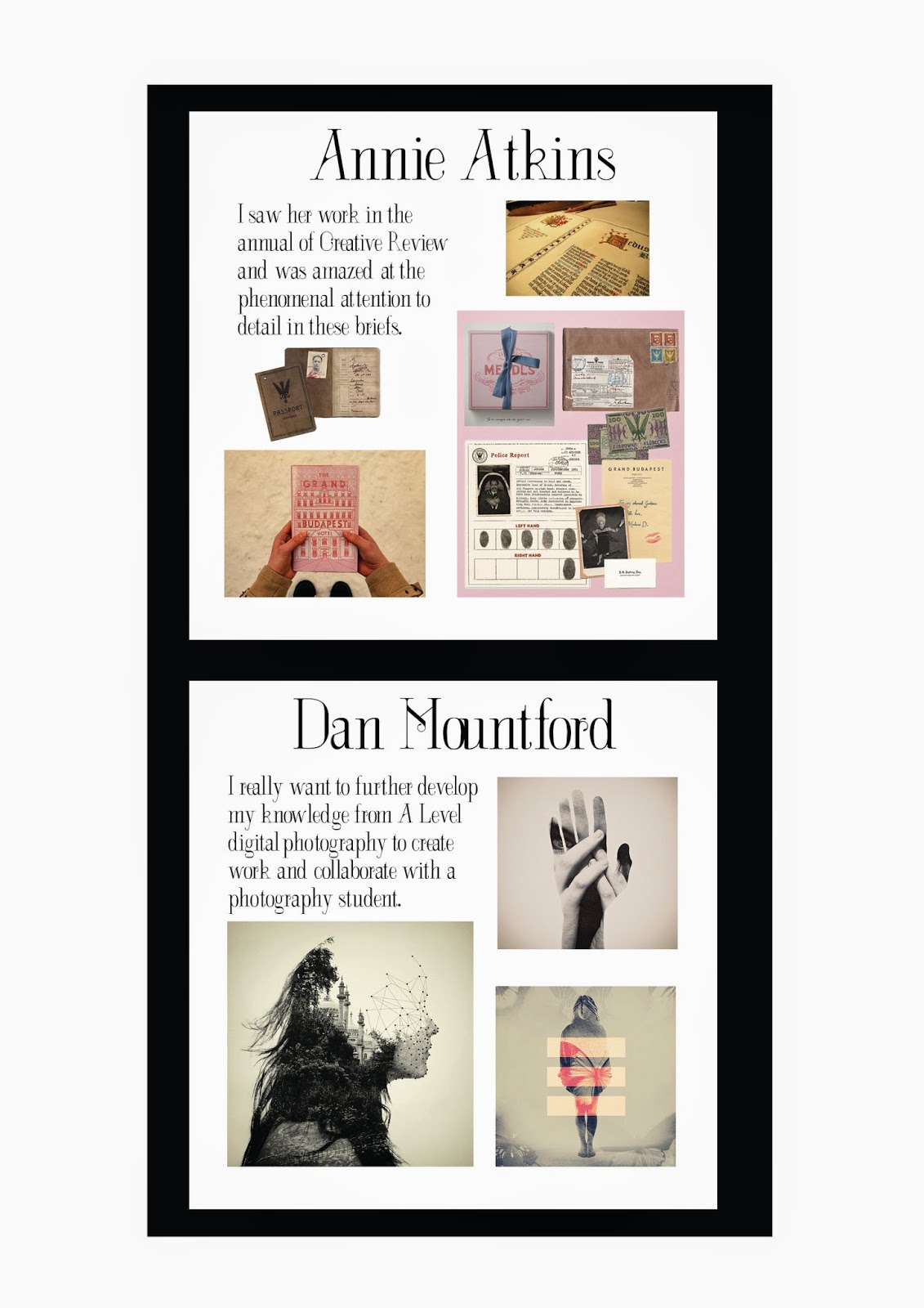
Design inspiration (examples of their work): William Morris (COP), Andy Smith (type, humour), Dan Mountford (photography and experimentation), Luke Pearson (illustration and collaboration), Jessica Hische (beautiful typography and hand rendered designs), Annie Atkins (films and other briefs) and Kate Moross (amazing inspiration).
Copywright to all of their work. I am only using their work as examples.
Beginning to design:
I initially started to try and design some form of graphics response in my name as I had looked at a few different forms of packaging I had which look like tags, however I think the design needs to reflect me and my love for history and femininity.
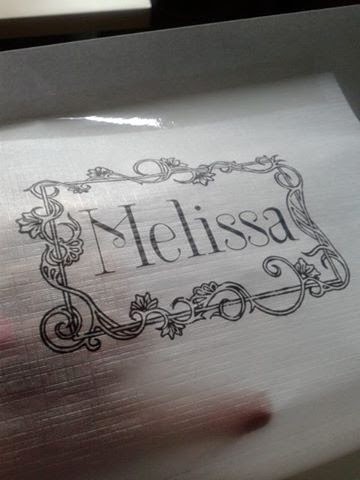
I think I will use a font which is inspired by the Art Nouveau movement (French) which I also think is quite important due to the fact I am quite fond of the country and culture.
I think the black works best as it is more simplistic and there wouldn't be a need for colour on the front.
I tried it in a variety of different textures other than the white matt above.
Tracing paper:
Eco friendly brown paper:
Pages ready for print: (I used a range of examples of others work and my own sketches scanned in for the pages about myself, I did this because I wanted to get back into drawing as I haven't done it in a while).
(Pages with sketches shown below)
Font size test prints:
I found that it was better to print the text in a larger point size and use less imagery because the font is quite thin and delicate and therefore difficult to read in a smaller size.
Test printing scale at home:
Printing at university:
I was really happy that the colour pigment turned out okay on the stock as I was worried that the images would be viewed with difficulty.
Cutting and constructing:
Pages glued together and left to dry:
I just need to figure out what is the best way to bind my book.
I tried it with string and then with a brown twine.
I found that the brown twine works much better as it aesthetically matches the rest of the stock/materials used.
Final images of book bound:
Overall I'm quite pleased with the outcome because I do think it does communicate myself and what I like. The font reflects my love for France as a country and also history as it is inspired by the Art Nouveau movement. The stock is recycled and eco friendly which therefore shows my love for nature and attention to detail within my research and sourcing. My own sketches show my background of fine art and an illustrative feel (hand crafted). The colours reflect the natural tones (brown papers and stock) however I have used bright pinks and purples to reflect that I actually quite like feminine and bold colours as a whole due to spending time in Europe and I'm not just influenced by the UK.
I asked a few people to look at the design and they said that they liked the use of binding and the materials which they thought were well considered. I think my choice of font for the body copy could of been better as it is a little difficult to read. Next year I think I will consider thinking about branding myself in a more in-depth format as this year I am only just starting and thought it would be more worth while to create something which shows where I'm at now.


No comments:
Post a Comment