Sunday 28 February 2016

PPP- Work in April- Networking

I had been struggling for briefs and trying to work for myself outside of the course both collaboratively or professionally so therefore I asked a designer I had spoke to before if there was a possibility of working together. This was her response: 


Hi Melissa,

That’s great news! I know of Source Creative. Well done on getting that placement. I suspect you’ll have got more from them as it’s a larger studio, there’ll have been more going on. Did you enjoy it?

At the moment, I’m currently only working on two big projects. I’m happy to bear you in mind though for anything that comes my way which I could get you on board with. April onwards is normally a good time for work coming in, a lot of folk get their annual budgets for the financial year, so go off and start spending it. If you want to drop me an email with all you contact details (phone etc) then I can add it to my contacts.

Hope it all goes well for you!

Kind regards,
Kathryn


.............................................................................................


This is something I am thoroughly looking forward to completing with her and will be back in contact with in the next few months. 

Thursday 4 February 2016

PPP- BRIEF 2 Work Placement 2

On week beginning 25th January I completed a work placement at Source Creative in Blackburn. 

Website: 


A few pictures of the studio environment: 


The studio were incredibly friendly and I worked with them and saw what they were working on too. The experience was very personal and that is something that continue on with their clients as they have a continuation of returning custom. Manners and chatting go a long way and this is definitely something I have learnt from this experience. 

Creative Director: Stephen Caton 
Designers: Ben and Howard 
Freelance Coder/ website builder: Alex 
Catherine Caton also works as a photographer and completes the everyday running of the business. 

They gave me a variety of different briefs to work on which I cannot post online, so this will be submitted on a disk or pen drive. 

 I worked on illustration and type for a brochure which will be part of an event, I also created illustrations/ layouts for a book along with working on some elements of developing a logo as part of an already existing brand. Working for smaller companies was something I thoroughly enjoyed and I want to pursue within my own work and even within extended practice. 

I also learnt a variety of different business tips as well for my own practice and this is something I will use for myself, Catherine told me about her time after university working as a freelance photographer she was only charging 20 pounds and that was barely covering her travelling fees, so she explained how to work out an hourly rate which is individual to me and reasonable for university student. They were incredibly friendly and also offered to have me back later in the year to go through more briefs with me and also how they deal with clients, this is something I will pursue later in the year! 


PPP- BRIEF 2- Totality Brief

From the logo created on the previous page I focused on looking at how the design could work across a range which would include different colours for flavours, by using black/white and bright colours these combinations ensure the pasta box is incredibly different to other items on the shelf. 


Experimentation with adding people involved with sports which further enhances the idea of 'Go' within the name: 


The concept of "go" means that the products USP is being shown as it meant to be a healthy snack alternatives for busy people. At this age many children are part of extra curricular activities such as sport. 

However after looking at the design I felt as though it was too male orientated so I included an image of a female as well as a male sports person. 


Examples showing how the brand can work across the three colours: 


Use of three bold colours to enhance the edgy attitude of the brand for teenagers. Green for Spaghetti Bolognese, Yellow for Creamy Carbonara and Red for Tomato and Herb. 


Pot lids:


From completing this brief it has allowed me time to look at packing and research thoroughly into designing for packaging which is something I haven't done before. They also had an in-house printing series where they could make 3d mock ups so that was interesting to see as they had created for companies such as masterchef and lynx. From this experience I have been able to determine that I prefer to create designs in a more personal environment for smaller companies and more contact time to gain further understanding of what a client wants from a brief. This wasn't a live brief so I am able to post this online however overall I believe I have pitched a design for a pasta pot brand which could be sold to teenagers due to the colours and vibrant nature of the elements I specifically chose to create a sporty and 'edgy' on the go meal. 


PPP- Placement Totality Brief (BRIEF 2)

Initial ideas for name/ concepts:


Name generation
 Cup Of Italy
Snack Bites
Snack Stop
Little Bites
Petite Pasta
Mini
 Pasta Pantry
Little Italian Bites
Pasta&Go
Pasta Time!  

Tag line?
 Little Light Snack
Light Lunch
Instant Pasta
Healthy Snack Bites
Instant Pasta Snack

Design ideas:

- Illustrative typography, curved/ handwritten look/ bright colours. 
- Ingredients based through vectors of items within the food as part of the wrap.

- Muted colours or black/ white which is more simple and modern looking. Textured type which is irregular, would appeal to older children. 


Typography experimentation   

Idea based upon quick meals, children at the age of 12-16 are often 'on the go' and active which includes sport. 


 The images below show experimentation with 'grunge' looking type as this appears somewhat edgy and would therefore appeal to a teenage audience who would find graphics for young children boring. 


PPP- Totality Brief: Research (BRIEF 2)

Market Research

Syminton's pasta product for children 12-16 year olds. Quick food fix/ lunch meal replacement. See brief. 3 products: Spaghetti Bolognese, Creamy Carbonara Pasta Swirls and Tomato & Herb Pasta Shells. 

http://symingtons.com/our-brands/ 


This design appeals to children through it's 'fun' looking typography. The colour palette is also consistent throughout the packaging with similar/ matching tones. The rounded bold font is suitable for the pack as it is for children and is illustrative. 
  

Food aimed at children include illustrations and bright colours, often in flat designs rather than photographs or realistic/ mature designs. 


M&S

http://health.marksandspencer.com/uploads/images/our_health_ranges/kids_packaging.jpg 

A wide range of supermarkets stock children's snacks including pastas or ready/ quick meals. The example above displays the ingreidents as characters and it is designed to also appeal to the parents as it isnt too garish in colour or design. 
 Waitrose

Much like the M&S example, Waitrose use colour and simple illustration to appeal to children as well as the parents. The child-like illustrative typography further ensures the design appeals to children. 


Asda 

Different to the previous designs, Asda use characters and large amounts of contrasting garish colours to appeal to children/ parents. They also use the tagline 'chosen by kids, approved by mums' which of course quite obviously displays the purpose of the product.

 http://www.bandb-studio.co.uk/wp-content/uploads/2013/08/news_littledish_bigimpact.jpg

Little Dish

Much like some of the other examples Little Dish use illustrations and characters on their packaging. However the colours they use arent overly bright and seem a little more mature and less vibrant this is perhaps because it is for older children or a higher end store. 


https://static.squarespace.com/static/52536652e4b007332ef4ecf4/52dec946e4b0ca499f87bce7/52dec973e4b0ca499f88c9a5/1311269497643/1000w/07_21_11_goodness3.jpg

 Tesco

 Tesco's design for children's snacks is different to examples seen in Waitrose and M&S, this is due to the price range and the audience. However this packaging follows a different route of character design. But again they use childlike typography, however this is more set due to being a softer serif. This allows for the illustration to be the largest element. 


 Morrisons

 They use the tagline 'Just for kids' across their range which again much like the Asda design states who the audience is. This is also shown through using small illustrations which intertwine with the photographs of the products on the pack. The illustrations are childlike and look somewhat like 'doodles' due to the coloured curled lines under the typography, there are also characters such as 'monsters' which interact with the graphic elements such as the coloured clouds. 

 Sainsburys 

They have introduced a new range called 'kiddyum' for a range of different snacks. They use the tagline 'made for mini tums'. They use illustrations of children to sell the product along with bright colours for the background. 

Heinz

They provide versions of their products in smaller sizes for children. The packaging for these is different to the standard and well known shade of blue as they use a variety of colours along which is also consistent in the typography too. The type is reminiscent of a chalk board which links to schools and therefore the age it is aimed at.  


Dolmio

Dolmio have their own range for children which is seperate from the standard sauces and other products for adults. They use 'my' as a way of making the brand different. The typography is also reminiscent of hand rendered type and use childlike smiley faces on the pasta shapes. 


Ella's Kitchen

Vector graphics with thick outlines are illustrative much like some of the other designs above. The type also follows this style by being a curved/ handwritten looking.

Ready Meal design. 

Design for children is often illustrative and not clean cut, this means that lines look uneven or in squiggles (this is because children tend to doodle). 


The use of black/ white and colour appeals to a slightly older audience, this is because the writing is still quirky yet more mature than some of the large amount of contrasting colours. 


Pasta Pots (The product)

Product aimed at adults:


The designs for older audiences tend to use more mature graphic elements such as flat colours and a lack of character design which tends to be suitable for children and a younger age category. 

The brief is aimed at 12-16 year olds so I researched into brands that are aimed at this age range: 

Apple (specifically the iPod)


Nike & Vans


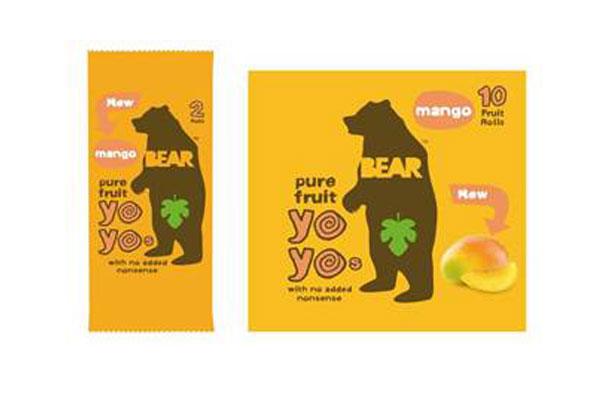
Brands that seem to appeal to this age group seem to be those who appear somewhat 'edgy' or different. This is usually because teenagers tend to like something which is different and fun. Within my own design I need to consider how these elements can be brought into the design. 


OUGD602: PPP- Work Placement (BRIEF 2)

On week beginning the 18th January I engaged with a placement at Totality GCS, Leeds. 

www.totalitygcs.co.uk


I worked mainly with the creative director who set me a brief which they completed in about 2012 or earlier. The brief and work for placements cannot be displayed online so therefore this will be shown through design boards for submission. However I did work on the branding and creation for a series of three designs for a snack meals/ instant pasta to come in three different flavours and to be aimed at teenagers aged 12-16. 

The experience of this week was interesting and definitely important to my development as a designer as I have been able to identify the environment and work I don't want to work in. The corporate environment wasn't the environment I expected from the initial meeting. They were also extremely busy so most of the week was spent completing work with little time for crits: this meant that when I had limited time with the creative director . 

OUGD603- Brief 1 Feedback

Tumtums was a brief from a website called brief box which was created by the design company Orca, therefore I sent them links to my work for feedback as they actually wrote the brief. 

http://www.onlyorca.com/work/


This is my email below:

Hello team of Orca, 

I wanted to share with you the work I've been doing for the rebrand of children's clothing store 'tumtums'. This is because I know your studio created the website and I enjoy looking through the projects you create. 


I put the brief together on behance and would love for you and others to have a look at it and perhaps give me some feedback too.


Thank you for your time,


Melissa Morris 
Level 6 BA Hons Graphic Design student of Leeds College Of Art


..........................................................


Their response is below: 


Hey Melissa, 

First and foremost I am so sorry for the late reply! We have been a little manic here trying to close down for Christmas and juggling the studio move. Thanks for sending this through! They're awesome! 

This is exactly the reason why Joel set up Briefbox, and you have interpreted the brief wonderfully. It is great to see you using your initiative and adding extra collateral to the brief to help bring the brand alive. 

Good work Melissa! 

Ellen


..........................................................

Its really great to hear back from the company who set brief box up to get their feedback on a brief that they wrote themselves, its interesting to see whether the work I have produced fits the brief in their opinion, as I seem to have managed that, for extended practice I plan on completing another brief from this website too as I thoroughly enjoyed it. 

Monday 1 February 2016

OUGD602: PPP outside engagement (BRIEF 2)

http://www.inkandpixelscreative.co.uk/about/


On the 7th January I called Kathryn to talk about her work and studio, engaging in conversation on the phone was brilliant as most studios I have called they have dismissed me as soon as they have realised I am a student. She was incredibly friendly and explained that she can't take in students into her studio due to the insurance being a freelance designer. However she did explain that she would be interested in giving me freelance work when she is very busy which is great! 


It will be great to see if any work develops from this in the future as she is a lovely designer and her work is very illustrative/ creative which is something I am interested in.