Previous self branding I created last year:
I looked at the elements from this and found that the logo I created last year worked perfectly on my Behance page and business cards. However I have found from the end of last year through to this year I have been refining the work I create through using illustrator more often and also elements of bright colour. The use of yellow with black & white creates striking contrasts and isn't too feminine, just simply bold which is what I want to portray for my graphic design practice. I also used this yellow throughout my PPP final presentation (see previous post).
Therefore I recreated my CV with added work experience I have had over this year. This will make explaining who I am to potential employers/ for internships much easier as it is all in one document.
I have found that when looking for inspiration for design I often seek outside of the UK a couple of examples of studio's are below:
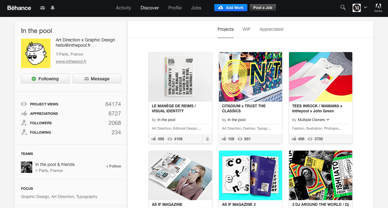
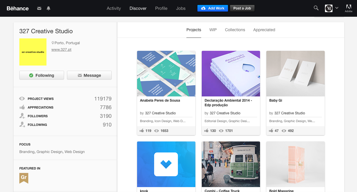

From looking at design studios elsewhere in the world I have been able to take inspiration in the form of colour palettes, layout and typography. I have found that over the third and final year of university I have started to refine my work which I know will always be a changing process of learning new skills and new ways of working. I have found in my own work this year I think more about colour and impact of a design in terms of the audience and this is relevant for own branding. Through using black/ white and a bright colour it not only portrays myself as a bright and friendly person but also my suggests that my practice as a designer is quite colourful and bold.
Why choose yellow?

Yellow is a positive colour that stands out and grabs the attention of the eye due to its luminosity. Therefore to help me stand out in terms of CV's and job applications the use of bold contrasts is a perfect way to capture the eye.
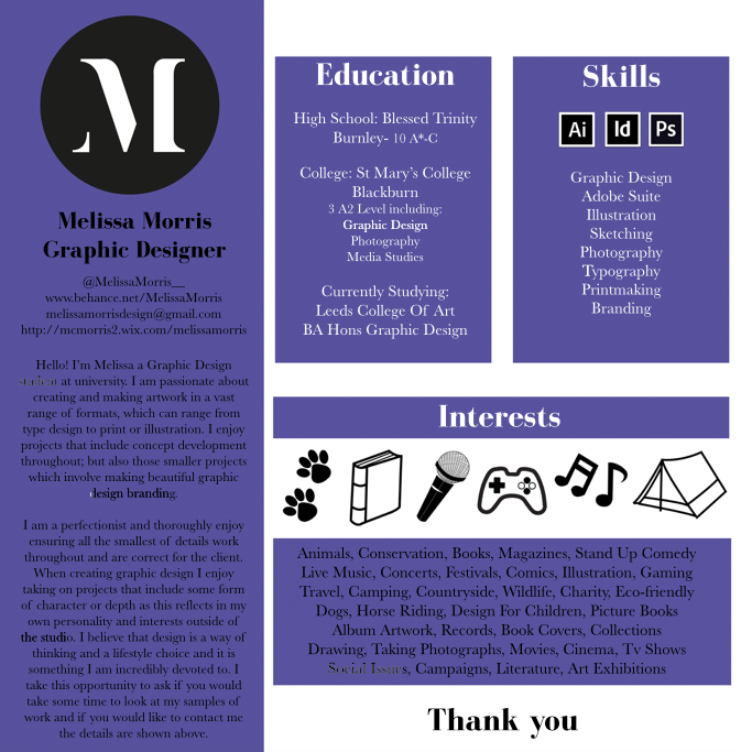
New CV:

I spent time putting my CV together with relevant information including a small paragraph I wrote about my practice which will also be found in the 'yearbook' publication for our end of year show:
'I am an ambitious
graphic designer specialising in brand identities, image making, packaging and
publishing. I am always committed to producing innovative, broad ranging design
with effective solutions. I am passionate about pushing the boundaries within
every project by creating unique concepts that I execute with high attention to
detail.'

I put this logo and my details across business cards too which are relevant for my practice especially due to the end of year show in the near future and attending events such as the Penguin Design Award evening in June. Having business cards to hand will be vitally important to be able to network and communicate ways to contact.
The content for yearbook publication includes the paragraph I wrote above about my practice but it also includes three images of my work which are:
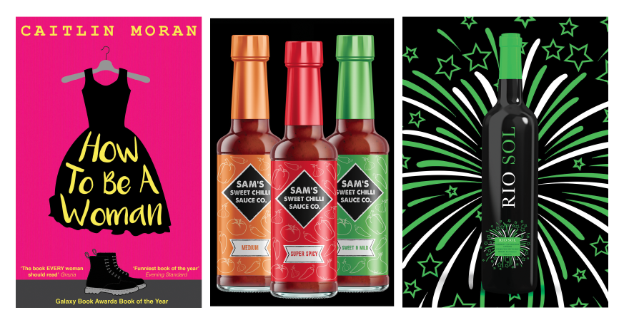
I chose these images for the book as it displays my achievement for this year which was being shortlisted for penguin. I selected the chilli sauce bottles as it displays my ability to work on a client brief based on packaging and finally Rio Sol which is a personal project and definitely displays the style for the large majority of my work which is use of colour and layout, overall impact.
With this in mind, to describe my practice I used BOLD, BRIGHT & BEAUTIFUL as my three adjectives for the yearbook which I feel as though in a condensed manner describe my practice as a graphic designer.
Online presence: In terms of having content online for now I feel as though using Twitter and behance is a good mix along with a printed portfolio for interviews and the end of year show. I have created the logo and colour ways I would use if I were to create a website for myself and with more time this is something I would develop in the future as a freelancer.
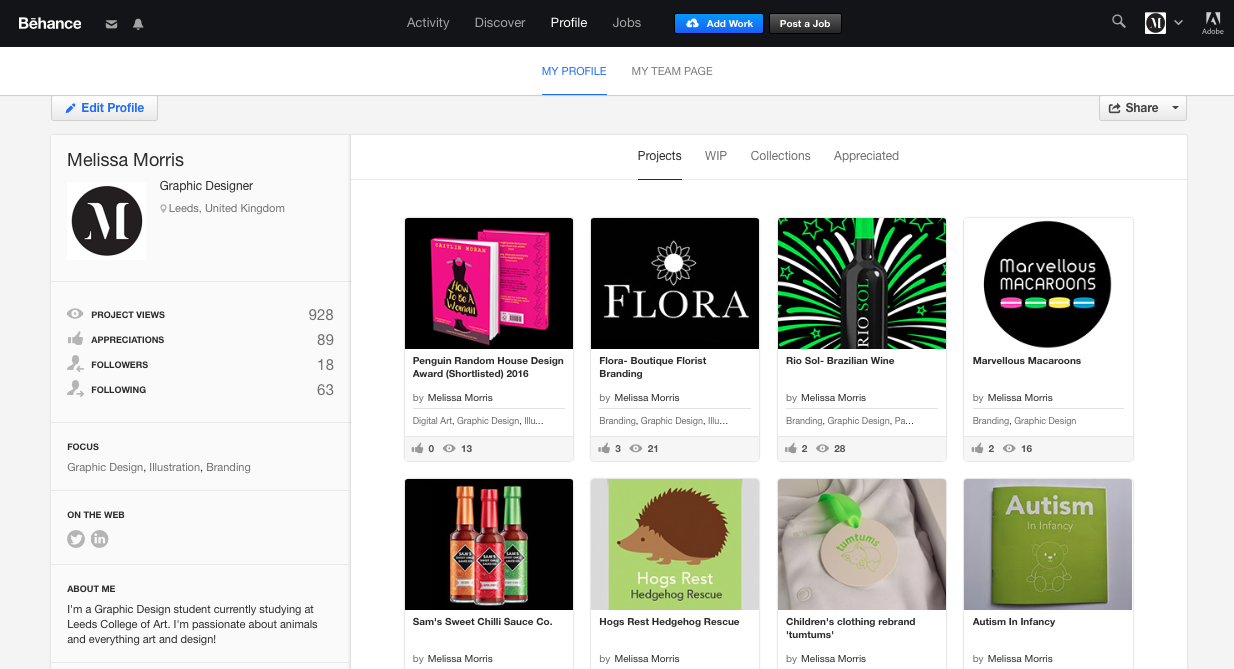

https://www.behance.net/MelissaMorris
Portfolio
To begin the portfolio I have continued the colour ways/ typography and logo seen on my CV & business card to create consistency. Within the portfolio the images need to be large to fill the pages and limited type.


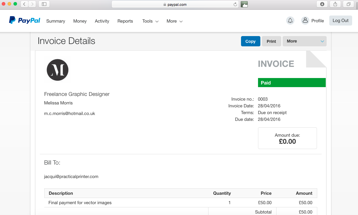
I also used my logo to help put together an invoice via Paypal which I have used for any paid freelance work I have done.
Evaluation:
The creation of new branding/ self promotion material has enabled me to contact studios and make connections with having my work seen. Through creating a paypal account and invoices it has enabled me to begin working on smaller freelance projects alongside university work and this is something I will continue over the summer. By creating business cards and having them professionally printed means that I now have a large amount of them I can take with me to events such as the end of year show and penguin design award evening as this would be a perfect opportunity to network. Using a simple layout and bold colours in my CV represents me as a person and as a designer as I have found that I tend to prefer designing with colour palettes and bold simple designs. The use of the bright yellow helps my CV stand out amongst my competitors for jobs and internships and I have already received excellent feedback on my designs on my Behance page. The use of online sites such as Twitter and Behance have increased my chances of my work being seen by studios in the Leeds area and beyond. By having self promotion material as a designer it gives potential employers a suggestion as to what kind of person and design I am which will be incredibly useful to use when I have graduated. As I have the basics of my own branding this will help when I am creating my own website over summer to gain further freelance projects. Overall I am extremely happy with the outcome and prints of my branding and this will be something incredibly helpful for now and in the future.
No comments:
Post a Comment